When I decided to start my freelancing business, the one thing that was the most challenging but also the most fun for me was deciding on a name and a logo. I wanted to convey competence, timelessness, and the power of words. I did not want to come across as cutesy or cartoony, and I didn't want something vague that didn't at least hint at what I do for a living.
And of course I had to consider trademark, copyright, and all the other legal odds and ends.
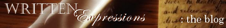
Written Expressions, LLC was at the top of a very short list of names I entertained. Honestly, I can only remember one other one from the list--Word Guru (that one got scratched not only because it was both cutesy AND cartoony, but also because another freelancer is already using it).
The graphic of the ink well, quill pen and parchment appealed to me because it's a classic image. It speaks to the history of the written word. I suppose I could have found a graphic of a cuneiform-covered clay tablet that would have done the same thing, but that's a little TOO historic for my tastes.
I also considered color and font style--in advertising, the color brown implies timelessness and utility. Castellar is an all caps font that gives the appearance of being engraved, and Edwardian Script ITC is one of the easier-to-read script fonts.
Now you know the method behind my madness. If you were me, would you have done anything differently?


Thank you
3 months ago


No comments:
Post a Comment