
I'm going to be redoing my website too, as time permits . . . if you have time, please have a peek at it in its current iteration. I'd love some feedback on what I can do to improve it. It's a free site, so I'm a little limited in terms of functionality, but I welcome your input on the content, and if you have comments on the look/feel I will do my best to get those worked in as well.


4 comments:
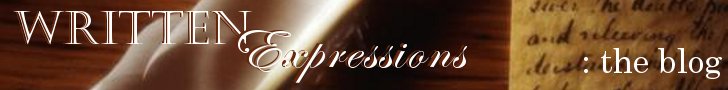
Your new banner is less crowded - looks clean ...same as your website. I'm not good at advice on websites - trying to re-do mine as it is (well, my good friend Kim is anyway!) but maybe something to "brighten" it a bit? Although, it's pretty clean and professional looking - I like sparse, but maybe it's too sparse?
However, websites that are all cluttered up hurt my brain!
I'm no help at all! *laugh*
I like the new banner!
- Cesia.
http://ceceatitagain.blogspot.com
You know, at first glance your old banner always reminded me of a crow sitting on a post (but it's just an ink well). I know, I know...time to get the contacts checked. ;)
Thanks for the feedback, everybody!
Kathryn, you're right--my website is sparse. I was trying to keep it all "above the fold" but I may have gone a little overboard (or underboard?).
Lori--a crow sitting on a post? Interesting . . .
Post a Comment